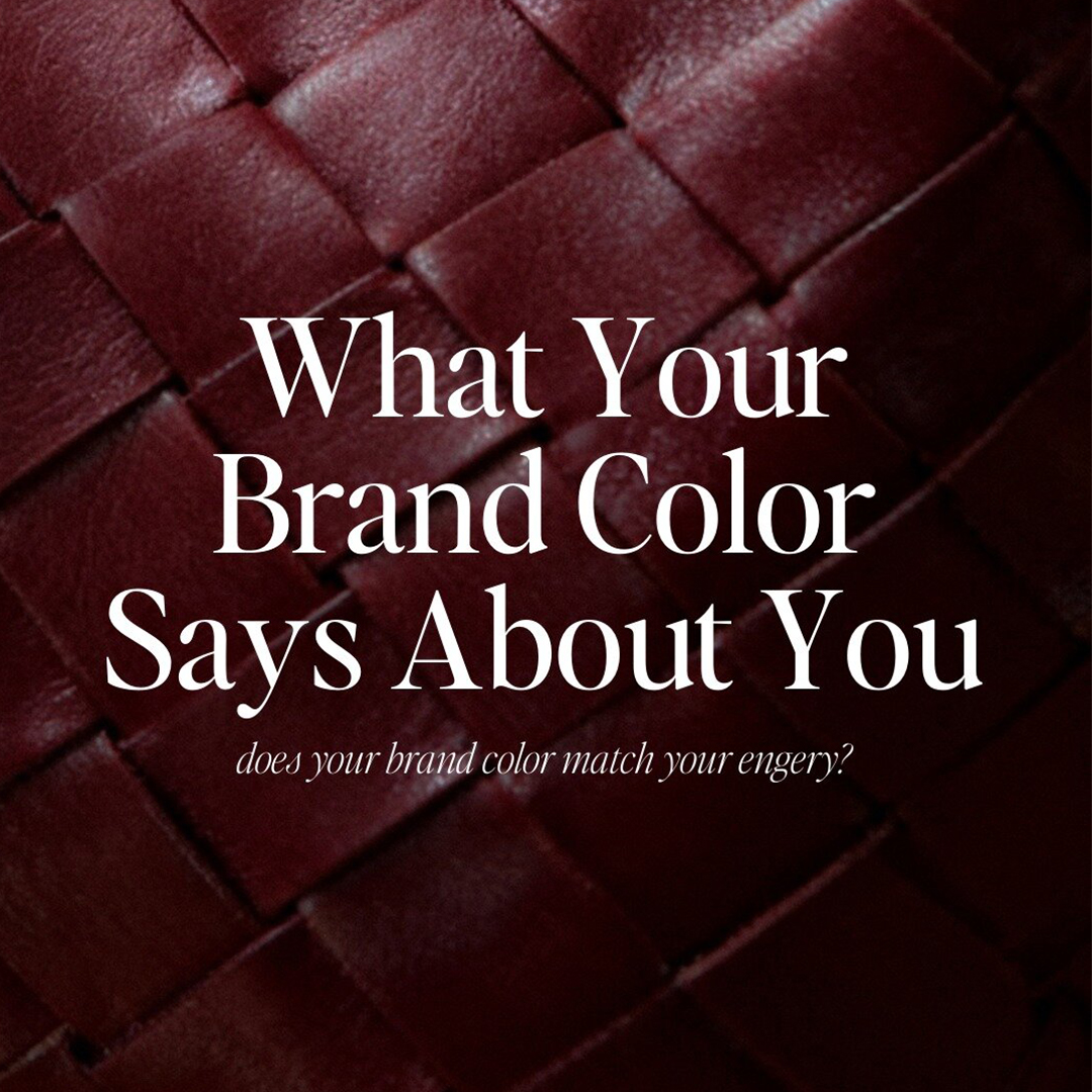
What is Your Brand Color Says About You
Your visuals are always communicating for you.
Before someone reads your bio, clicks your link, or understands what you offer, your color palette has already made them feel something.
Calm. Curiosity. Trust. Desire. Ease.
And it’s not just what color you use.
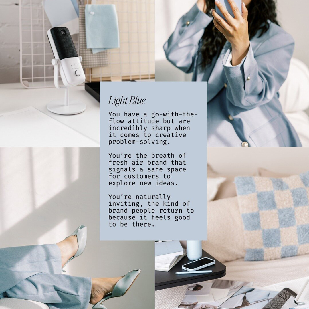
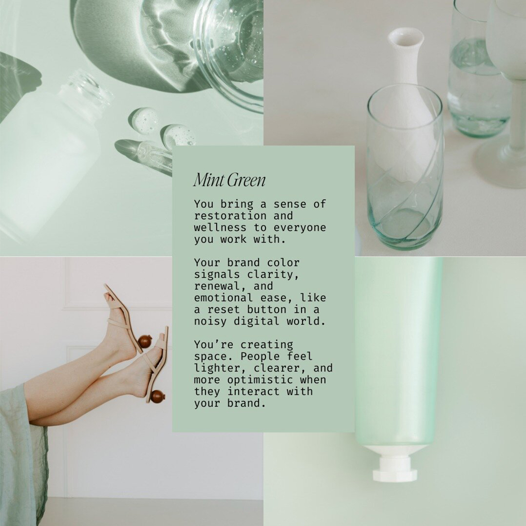
A light blue can feel open, refreshing, and approachable.
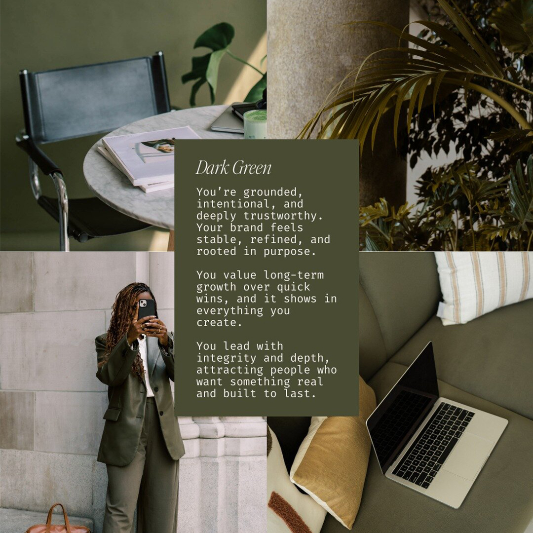
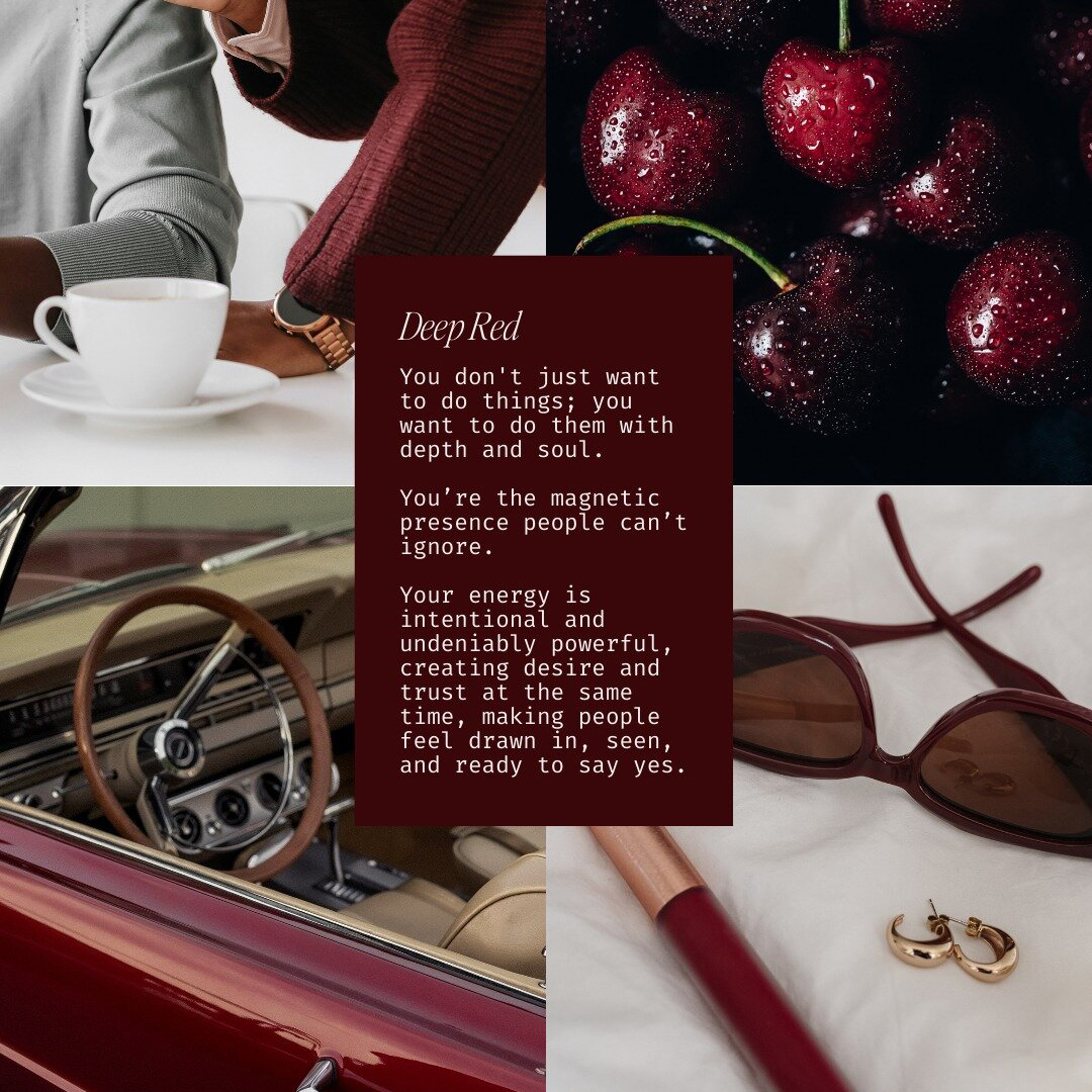
A deep blue can feel grounded, confident, and authoritative.
Light vs. dark, soft vs. saturated, these choices shape how your brand is perceived and who it attracts.
That’s why being intentional about your brand colors matters.
Pro tip: Inside the international Pantone library, you can filter images by brand color, so every photo you use reinforces the feeling you want people to associate with your brand, not just your aesthetic, but your energy.
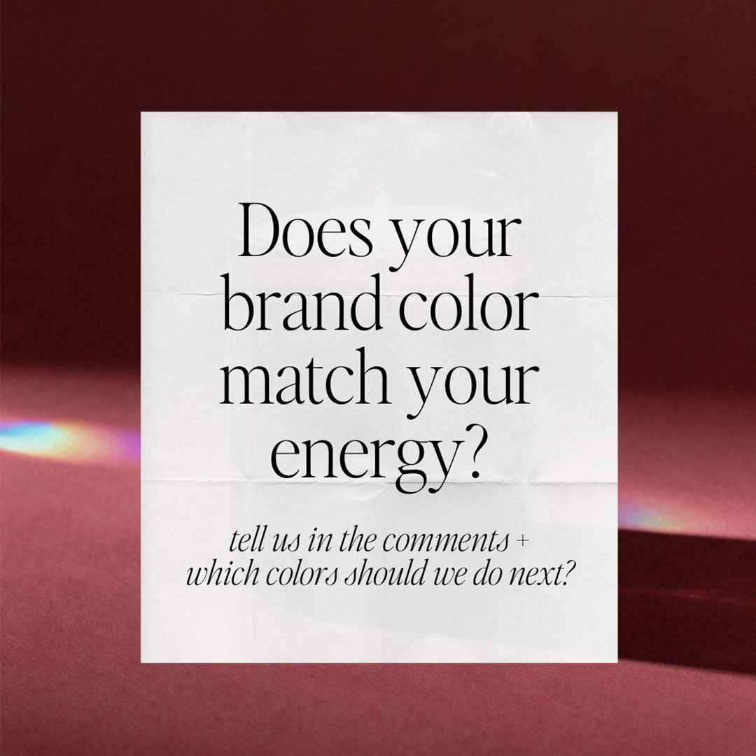
So tell us…which color felt the most you?
And does your current brand palette really match how you want to be perceived?
Save this articles for your next brand refresh, your future self will thank you!